These effective web design tips you must keep in your mind when you are creating or redesigning a website. There are specific and important items you need to be made aware of. Things that normally wouldn’t cross your mind. The average company is after sales and revenue. They may tell you that they want the big flashy logos. Or, they may tell you they want the overdone textures/gradients. However, it is the job of a well skilled web designer to steer their clients in the right direction.
Listed below are sixteen do’s and don’ts of effective web design. Study, read, and print this page. It will help either make or break your website. And don’t hesitate to let us know of anything we might have left out, in the comments below. ECA Technologies and Designtorontoweb.ca love getting your opinions on things and discussing the articles with you.
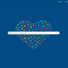
 1.Do Not forget your search form
A lot of people will go to your site and immediately look for a search box. It’s just instinctive I guess. So, if you don’t have one, guess what happens – they leave. They’re not going to feel comfortable on a site where they don’t feel in control. The ideal spot for a search bar is somewhere towards the top of the page on the right hand side. This is where users are used to it being displayed.
2. Do make your navigation easy to find & readable
You’re designing a site and your navigation is supposed to take your visitor from point A to point B. Why the hell would you place it in a weird spot? Or use images that do not generally showcase the type of links they are? Try keeping the navigation easy to read. Keep it right at the top of the site so the visitor can easily navigate through your site.
3.Do Not make your “contact” link in your navigation bar a mailto: link
A lot of people (myself included) will hover over a link. They will see what the bottom of our browser screen says before we click on it. Especially, the contact link. Some people think it’s a bright idea to link this directly to your email address, causing an email program to open up. This is not a good UX practice. Create a contact page, put your email address on it and also add a contact form. Your user will thank you.

4.Do utilize UX Apps as much as possible for web tests
Keep track of the various forms of data from your website. And if you haven’t already, start keeping tracl now. Google analytics is perfect for seeing where your visitors are coming from. It can also see what pages they’re going to. Also how long they’re on your site. A UX app like is perfect for learning. It is where your visitors are clicking and seeing what parts of your site are getting the most attention. Learning these types of stats for your site can ensure you’re utilizing space. It is also making sure that you’ve got the important stuff where it needs to be.
5.Do Not flood your website’s sidebar with tons of widgets
O.K. We get that you’re running a blog and there are a million widgets you can use on it. However, you don’t actually need to use them all. Think of it like a bedroom. If there’s clutter everywhere and it’s not clean, that special someone you brought home might not want to stay – so tidy up and keep things organized. Your readers don’t (in most cases) need to see your google friend’s, mybloglog friends, friendfeed friends and the various other social profiles you’re a part of, so leave them alone and stick to the things that matter most for the user experience on your site.
6. Do make sure that your website displays well on various browsers
We all know that IE6 is dead and no one is complaining about that, but do not forget that there is still a lot of users on IE7, IE8, Opera, Safari, Firefox, Chrome, ect. Just because your website looks good on one or two of them doesn’t mean the visitor using another browser will like that your site isn’t displaying properly. Take a couple hours, dig into the code and make sure it all works across the various browsers.

 7. Do Not make your visitor jump through hoops to fill out a form
Your contact form shouldn’t be a mile long and neither should a sign up form. Keep things simple. The chances that people will turn away when they’re faced with a 20 part sign up form is far greater than if they were staring at three simple questions (name, email, comments).
8. Do ensure your various pages are consistent in structure Unless you’re a design blog and you’re structuring/designing every one of your posts different like (insert names here), you need to remember that people want familiarity when they’re viewing your site. If they feel like they’re somewhere different when they load a new page up, they’re going to click the back button – and fast.
9. Do make sure your content is easy to scan and follow along with
In general, people have short attention spans. So, by utilizing section titles (h2, h3 or h4 tags) to split your article up, you allow the visitor to scan the article quickly and see if it’s something they’re looking to read and if they’ll be able to get anything out of it. When you’re writing your content, you should also be aware of the size of each paragraph as users will tend to get tired of scanning 20+ lines in a paragraph. Things are much easier to read when split up into 5-10 lines (at most).
10. Do Not cram more into a space than what can fit comfortably Minimalism. Less is best… We love it here at Designtorontoweb.ca and I know readers here do as well. That’s why this tip is so important to all of us – crowding things into a small space and not allowing the users eye to focus on the important stuff is counter productive. Yes, you’ve got a ton of information above the fold, but why would you worry about the fold so much? So allow your design and content to breath. Your users will thank you.
11. Do make sure to include breadcrumbs in your design
Breadcrumbs are useful in giving your visitor control over where they’re at and what they’re going to do next. If they’re on a sub page of your about page, your breadcrumbs will look something like this (Home > About > Sub Page Title). This tells the user exactly what page they’re on and how to go back various levels if they’d like to.
12. Do Not forget to utilize color and contrast to shift focus
If you use a heading and then a sub heading for sections of your site, try various shades of color to allow the visitor to notice the important stuff first (ie: #464646 for the title and #c1c1c1 for the subtitle). These shifts in color and contrast will dictate what your user sees next, ultimately bringing them into a space where you want them to be (a sign up page, a contact form, a subscription page, ect).
 13.Do check for broken links and images Checking for broken links and images in your older articles is great because you may have visitors coming to your page from a search engine and if there are broken links, they’re going to assume one of two things: 1, you’re an old site that isn’t being updated anymore or 2. you’re not keeping up to date on the value of your site, so they’re going to go elsewhere. If you’re a wordpress user, there’s a plugin that is amazing for this: Broken Link Checker. You can also head over to iwebtool and use their free broken link checker (5 requests per hour is the limit).
14. Do Not neglect your footer and the power it has So, you’re on a website and you scroll through everything and get to the bottom of the page only to find a bland, single line of text telling you that there’s a copyright on the site. Boring. Why not spruce your footer up a bit, add some extra content into it like popular articles, a search box, a newsletter subscription, ect. If you’d like to find some ideas on how to design a killer footer for your site, you should check out Footer Fetish, not to be confused with the other foot fetish.
15. Do use wireframing in your design process Drawing out wireframes for your site on paper (or in simple box shapes in photoshop) can really help you visualize what’s the most important aspect of the page and how you can use it as a central focus point. By doing this, you’re also able to experiment with various layout options without having to break up a killer design you may have been creating already
16. Do Not write for search engines – write for your readers Last, but not least is the tip that you should be writing for your readers, not search engines. Keyword stuffing may have worked in the past (and may still today), but if you have an actual reader come across your page, only to find the word “designer” 100X times in 3 paragraphs, what do you think the odds are that they’re going to hit their back button and never step (virtual) foot on your page again? Yeah, the odds of that happening are extremely high.
A tip I’ve heard before is to read your content out loud and if it doesn’t sound like a natural flowing conversation you’d normally have, rewrite it until it does. People will read your content and expect it to sound like something a real person would say, so make sure it does sound that way so it’s an effective web design element.